
Facility Grid is an enterprise Operational Readiness B2B platform engineered to centralize, digitize, and track complex quality control and commissioning (Cx) processes for mission-critical infrastructure projects. The platform tracks and validates thousands of high-stakes building assets—such as mechanical, electrical, and plumbing (MEP) systems—throughout the construction lifecycle to guarantee a project is truly ready for handover.
As the Senior Product Designer, my mandate was to overhaul a heavily technical legacy ecosystem into a high-performance web and mobile application workspace. I led the end-to-end UX/UI strategy to transform massive data matrices, intricate milestone schedules, and field-testing validation logic into an intuitive interface built for absolute precision.
Facility Grid: Designing Clarity for Complex Engineering Workflow
Context
Problem
Data Fragmentation & Cognitive Overload
Engineering teams routinely manage thousands of interconnected building assets across multiple contractors, trades, and schedules. This creates fragmented tracking loops, manual data entry errors, and severe cognitive fatigue. The platform needed an interface capable of displaying dense multi-dimensional asset layers and project health statuses simultaneously, ensuring engineers maintain full situational awareness of project risks before on-site commissioning begins.
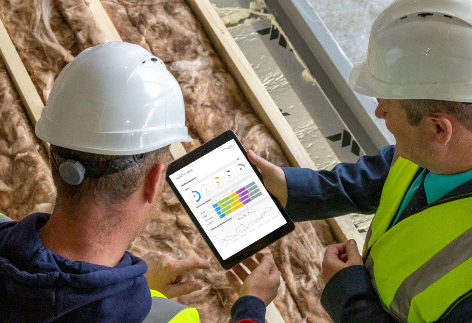
The Execution Barrier in Field Validation
Coordinating complex system testing and asset verification between desktop-bound project managers and on-site field technicians historically suffered from a severe disconnect. Legacy interfaces forced users through long, rigid text forms and manual spreadsheets. The system lacked a streamlined, responsive visual workflow that allowed field technicians to confidently execute tests, verify equipment details, and sync live progress back to management without administrative friction.
Process
and Proposal
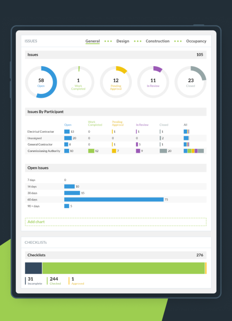
Phase 1: Executive Dashboards & Analytics
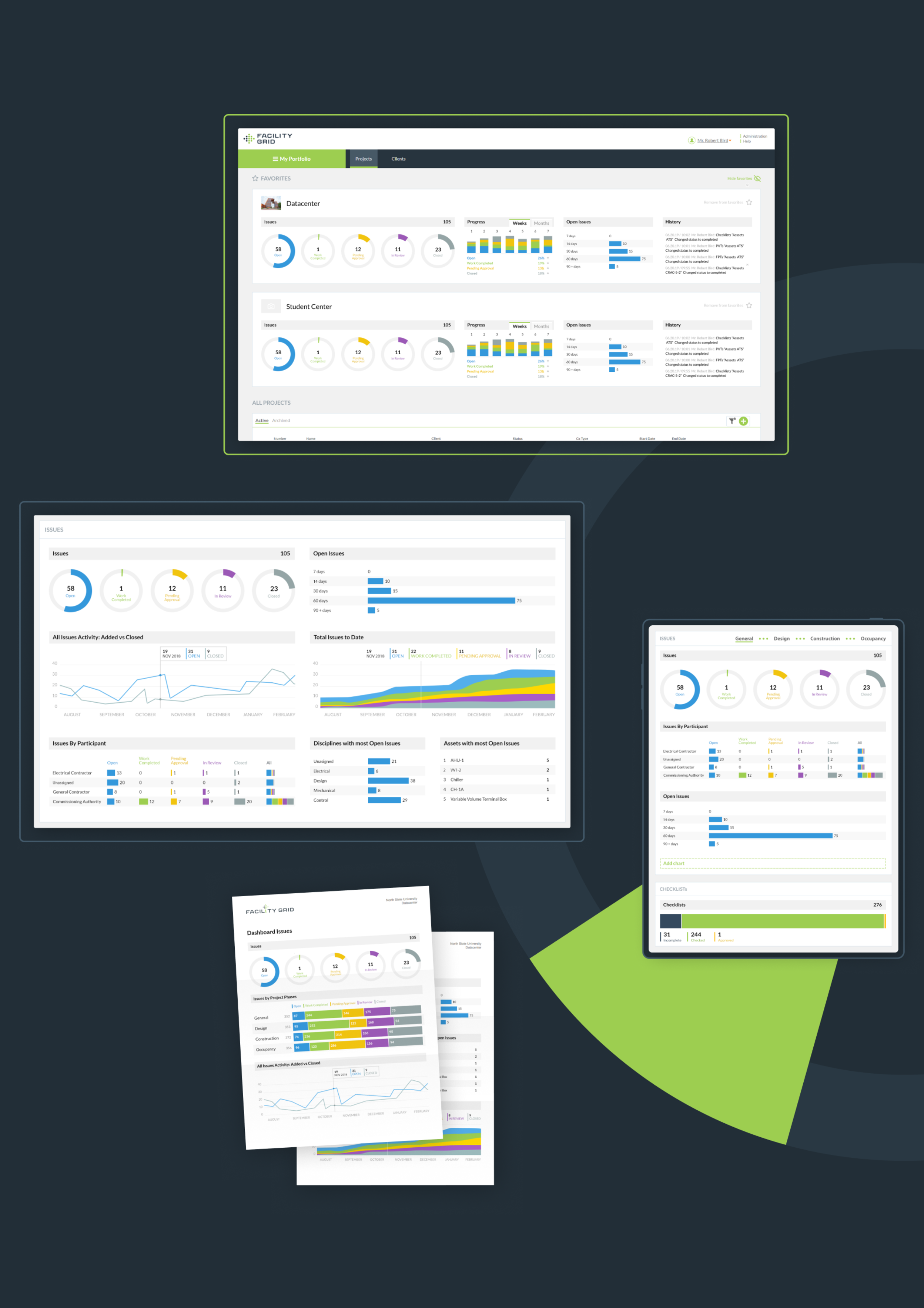
Tracking overall project readiness across endless rows of numbers frequently leads to overlooked risks and delayed timelines. I reimagined the platform's landing experience into a centralized, high-density visualization command center.
What I Built:
A modular dashboard framework pairing interactive project health indicators, milestone tracking meters, and real-time risk distribution charts.
Why This Way:
Turning raw operational numbers into highly scannable visual indicators allows building owners and general contractors to instantly pinpoint bottlenecks or project delays at a glance, eliminating long manual review loops.
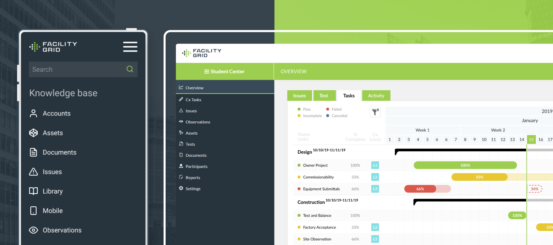
Phase 2: Interactive Timeline & Scheduling
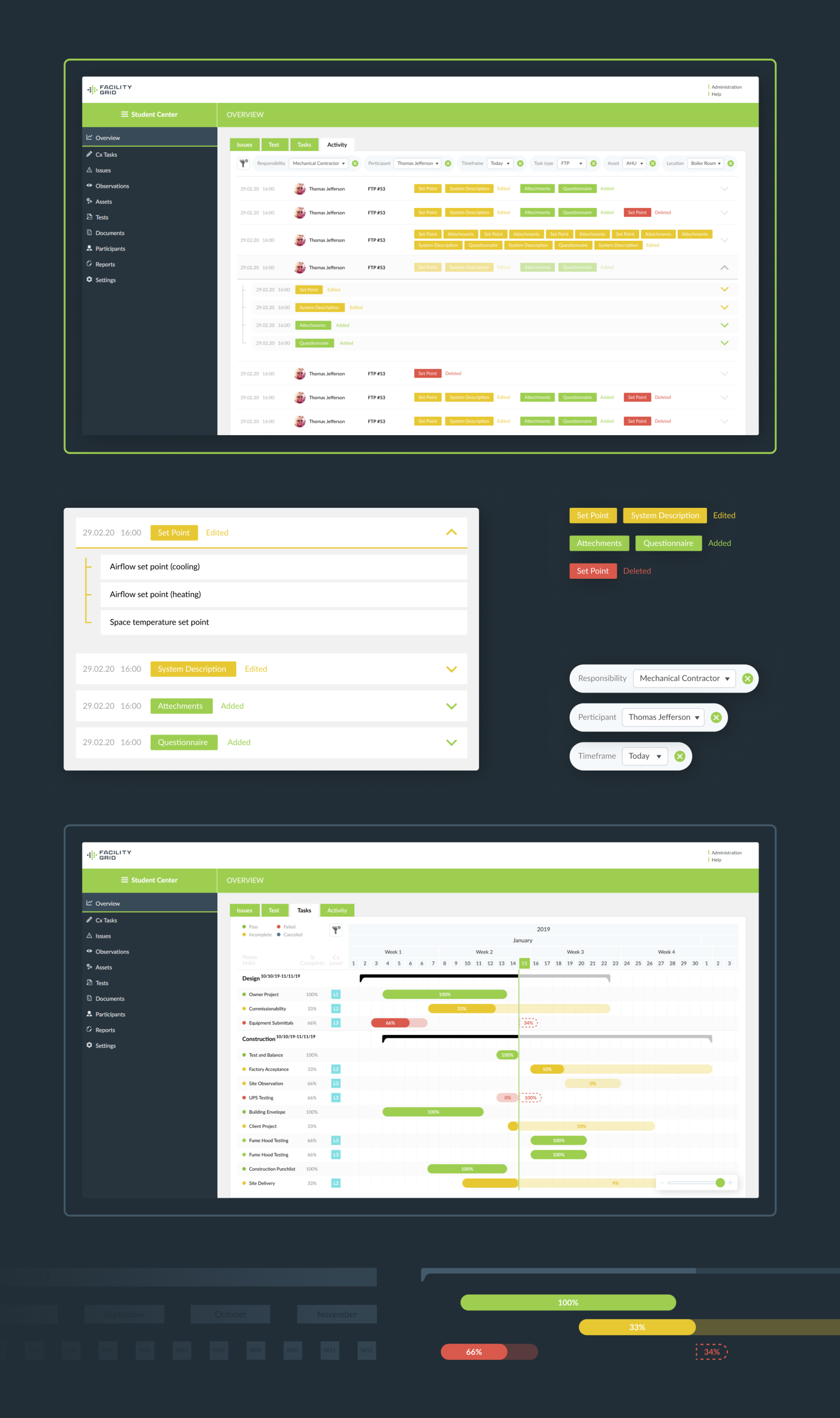
Coordinating multi-phase commissioning tasks and overlapping dependencies across a broad stakeholder group using text-heavy forms inevitably causes critical scheduling conflicts. I redesigned the scheduling framework into an interactive visual roadmap.
What I Built:
A high-performance, interactive Gantt timeline interface featuring drag-and-drop task adjustments, dependency mapping, and real-time status badges linked to the project schedule.
Why This Way:
Spatial timeline mapping provides immediate visual understanding of sequence logic and active phases. This safeguards engineering teams against scheduling conflicts and alignment risks, ensuring complex commissioning runs "always on time".
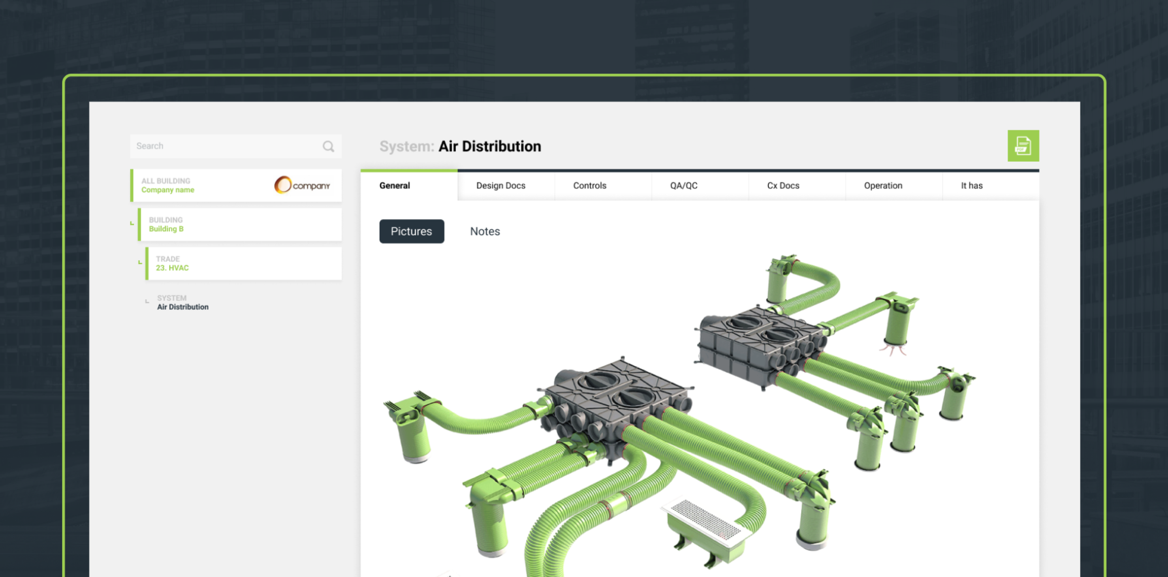
Phase 3: "Precision Asset Verification" – Dense Data Grid Systems
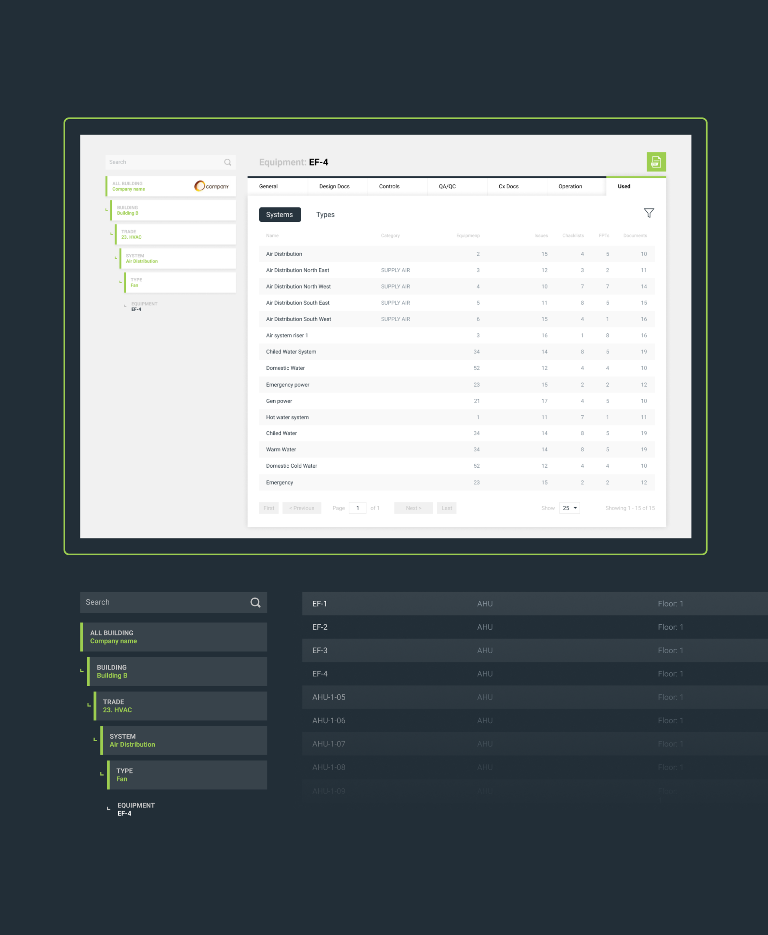
Field and office engineers routinely handle high-volume data tables. Cluttered tables slow down validation and increase manual sign-off friction. I engineered a customized grid system built to handle dense information effortlessly.
What I Built:
Highly dense data grids featuring customizable column filtering, inline quick editing, and prominent, color-coded asset validation badges.
Why This Way:
Stripping away visual clutter while maintaining high data density allows engineers to scan and verify thousands of technical assets rapidly. Contextual rows reduce cognitive overload, accelerating the formal verification trail needed for final owner handover.
Phase 4: Structural Knowledge Base & Platform Documentation
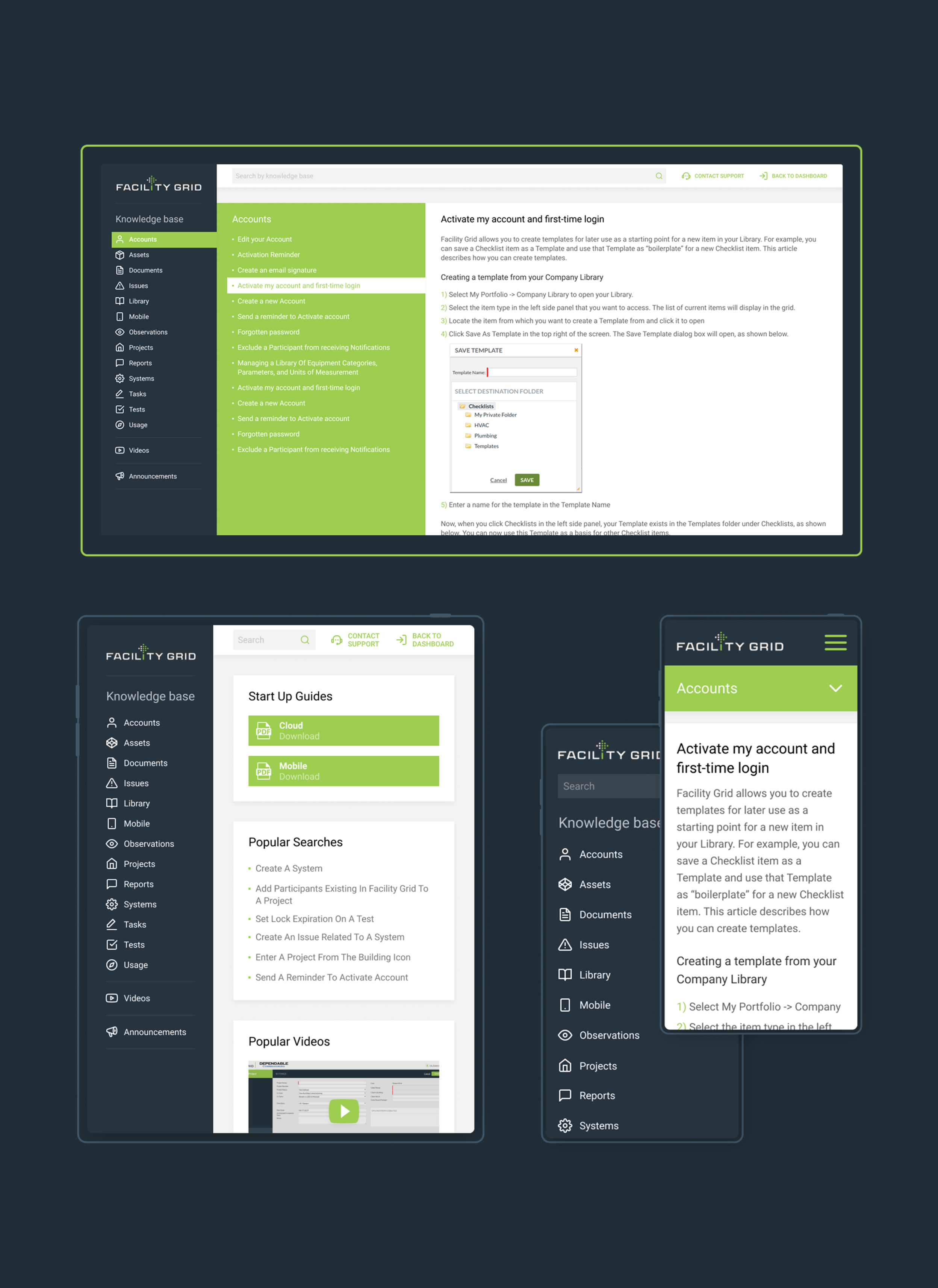
Navigating complex platform rules and training protocols across fragmented PDF manuals or external links disrupts the engineering workflow. I designed a centralized, high-density Knowledge Base platform module to streamline documentation and accelerate user onboarding.
What I Built:
A structured documentation portal featuring a multi-level sidebar hierarchy, categorized quick-access resource cards, integrated search bars, and an inline step-by-step article viewer.
Why This Way:
Organizing instructional content into a clear, unified layout allows field engineers and trade contractors to quickly look up testing protocols and platform workflows. This transforms dry technical documentation into an organized, scannable library, reducing onboarding bottlenecks and ensuring uniform system compliance across all project teams.
Result
By simplifying multi-dimensional data models and introducing high-clarity visual workspaces, the redesigned platform achieved exceptional user adoption alongside significant operational improvements.
Drastic Reduction in Administrative Overhead: Shifting from manual spreadsheets and form-heavy entry loops to the optimized data grids and unified workspaces streamlined validation workflows, yielding an estimated 25%+ reduction in administrative work for engineering teams.
Decreased Critical Scheduling Conflicts: The interactive Gantt timeline mapping and clear status architecture successfully reduced accidental timeline overlaps and overlooked project dependencies, minimizing deployment risks on high-spend, mission-critical builds.
Accelerated Cross-Team Collaboration: The cohesive, scannable visual design system allowed diverse stakeholders (Owners, General Contractors, and Trade Technicians) to parse live project health and platform workflows without specialized training, significantly improving tracking transparency across the entire construction lifecycle.