
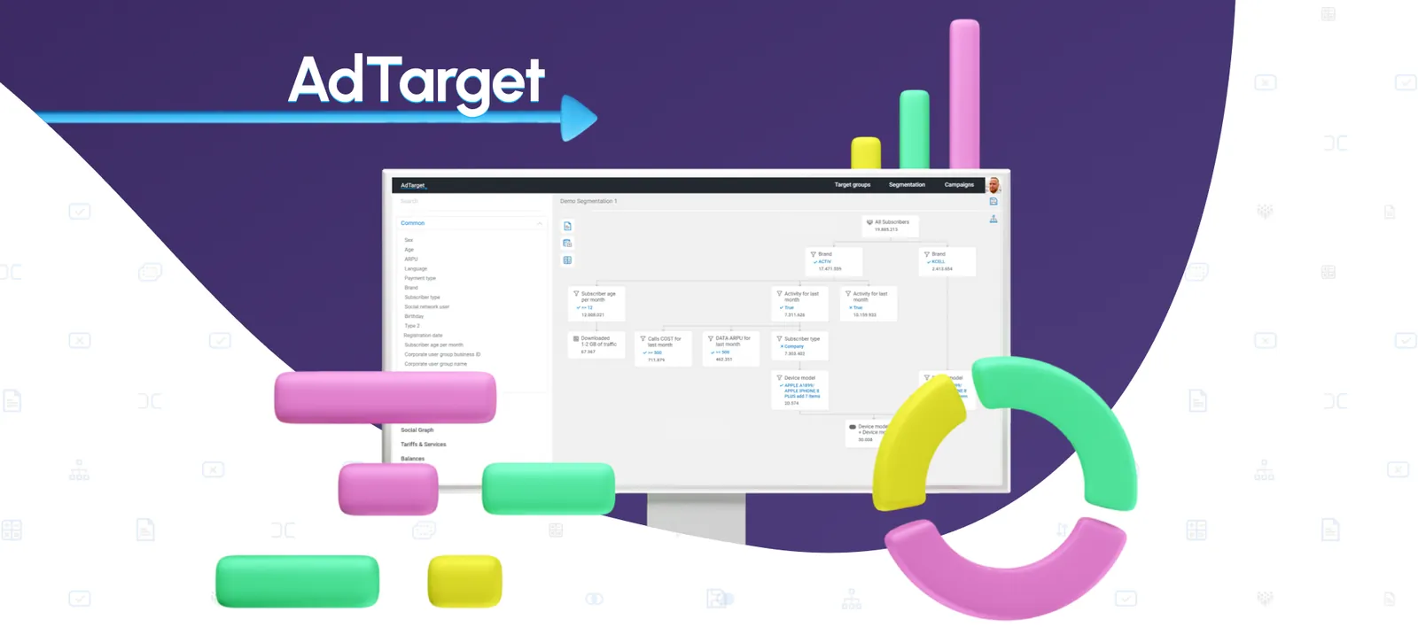

Bringing order to multi-channel ad campaigns
AdTarget is an enterprise B2B SaaS platform engineered to centralize, automate, and optimize complex cross-channel digital advertising campaigns — ingesting massive amounts of multi-platform data to help performance marketing teams orchestrate high-budget campaigns and automate media buying.
My mandate was to overhaul the fragmented, highly technical legacy architecture into a seamless, high-performance web application, transforming complex data matrices, scheduling systems, and automation logic into an intuitive, high-visibility workspace built for speed and precision.
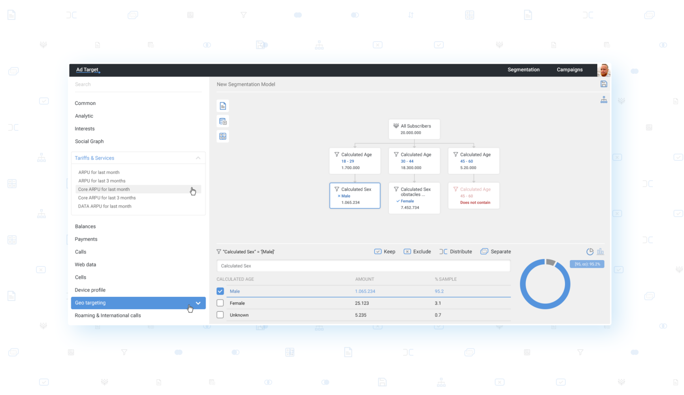
Data Fragmentation & Cognitive Overload
Enterprise marketers routinely manage campaigns across disparate ad networks, causing siloed data, tracking errors, and cognitive fatigue. AdTarget needed an interface that could ingest vast multi-dimensional data sets without ever overwhelming the user or costing them situational awareness of live ad spend.
The Execution Barrier in Automation
Configuring advanced multi-channel workflows and cross-conditioned audience segments traditionally required deep technical knowledge or rigid, text-based Boolean forms. The platform lacked a visual mechanism for non-technical media buyers to confidently design and deploy automated marketing paths without fear of misallocating massive budgets.
“Always Under Control” — Interactive Timeline & Resource Allocation
What I Built
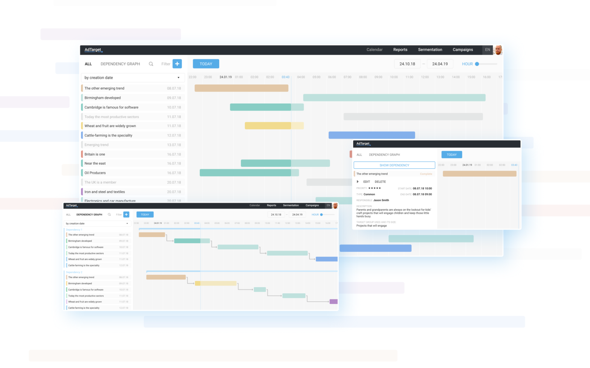
Managing overlapping campaign lifecycles, budgets, and distribution schedules through standard forms frequently led to costly errors, so I reimagined the scheduling mechanics as an interactive, visual media flighting timeline — a multi-layered Gantt-style interface with inline editing, synchronized budget-cap markers, and expandable campaign nesting.
Why This Way
Giving users a visual timeline provides immediate spatial understanding of active, upcoming, and paused campaigns, safeguarding teams against overlapping flight dates and budget conflicts.
Multidimensional Segmentation — Analytics & Data Visualization
What I Built
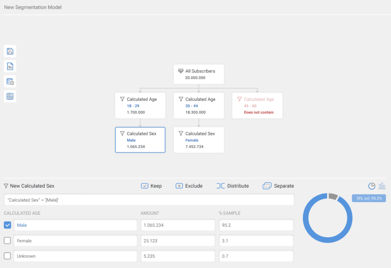
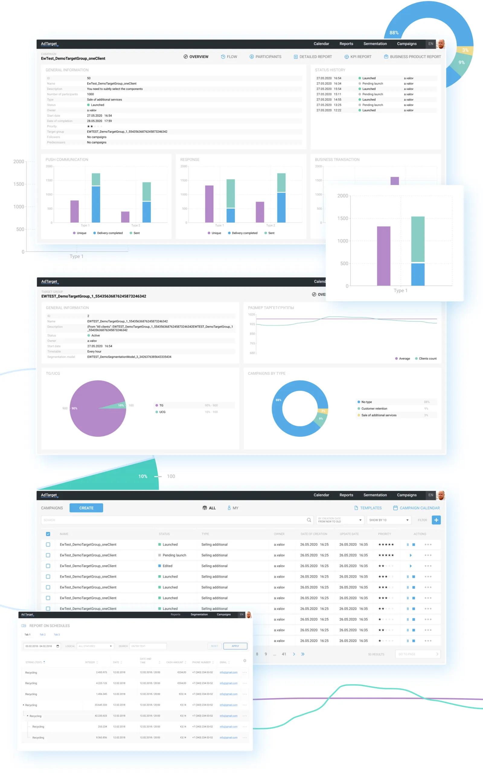
Audience targeting frequently stalled when users had to navigate dense tables to extract value, so I designed a modular analytics interface pairing filterable tables with interactive donut charts, multi-variable bar graphs, and real-time comparative trend lines.
Why This Way
Visualizing demographic and behavioral data side-by-side lets marketing managers isolate key audience performance trends at a glance, eliminating long spreadsheet deep-dives.
Unified Campaign Management — Node-Based Canvas Architecture
What I Built
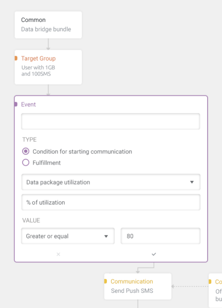
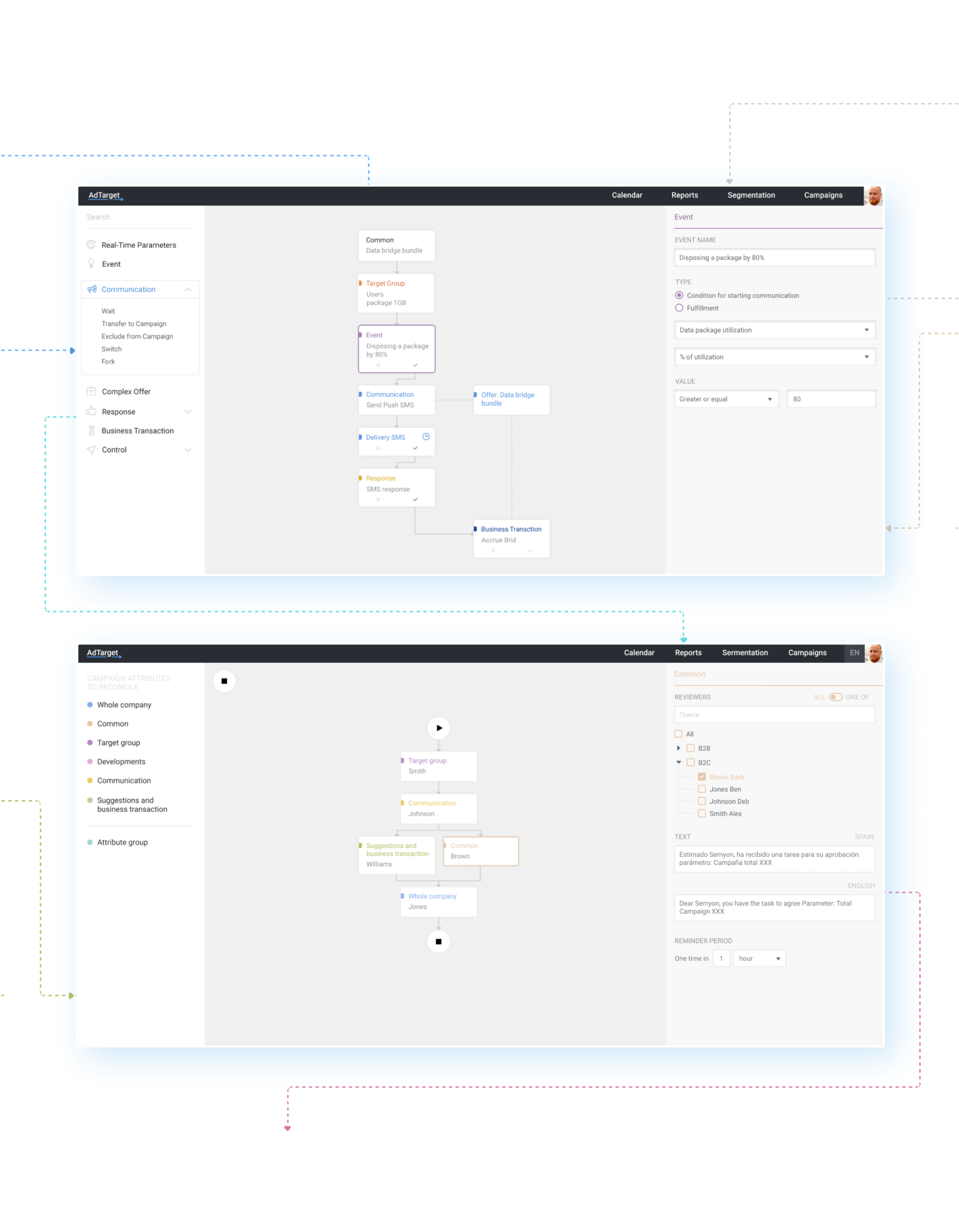
To bridge the execution barrier, I replaced rigid, text-heavy parameter forms with a spatial visual workflow creator: an intuitive drag-and-drop canvas built on customizable step-nodes connecting channels, conditional triggers, action items, and data routes.
Why This Way
Mapping automated sequences visually removes the abstraction of backend rules, letting media planners construct, audit, and troubleshoot complex customer journeys with clear logic paths and far fewer deployment errors.
By simplifying multi-dimensional data models and introducing high-clarity visual workspaces, the platform achieved exceptional user adoption alongside significant operational improvements.
Drastic Reduction in Setup Time
Replacing form-based rule writing with the node-based canvas and visual timeline streamlined orchestration, yielding a 45% reduction in end-to-end campaign setup time.
Decreased Configuration Errors
The “Always Under Control” timeline and unified workspace reduced accidental budget overruns and overlapping scheduling conflicts by 35%, bolstering platform trust among high-spend accounts.
Accelerated Cross-Team Collaboration
The intuitive design system let creative directors, data analysts, and executive sponsors parse live campaign health without training.
Seamless Interface Scalability
The modular design system proved highly resilient, letting engineering ship new dashboards and integrations with consistency and minimal friction.
Next case study

