
A German SaaS pioneer building AI Digital Colleagues
ALAIQ is a German-based SaaS pioneer that builds “Digitale Kollegen” (Digital Colleagues) — sophisticated AI-enabled agents designed to handle complex administrative tasks, such as procurement, invoicing, and logistics, within existing corporate workflows.
My mission was to shape the company's product ecosystem from the ground up: translating highly technical AI mechanics into an intuitive, trustworthy, and human-friendly enterprise experience.

The Trust & Comprehension Gap (B2B Marketing)
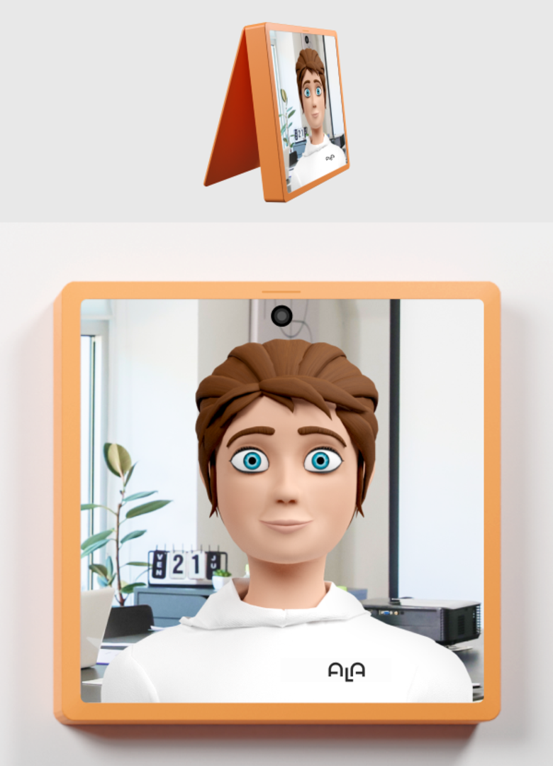
AI automation is often perceived as intimidating, complex, or a threat to jobs. We needed a brand identity and a customer-facing website that reframed “AI automation” into a collaborative, friendly, and highly approachable “Digital Colleague” that employees would welcome.
Product Complexity & Interaction Barriers
Configuring a custom AI agent — defining data skills, software permissions like SAP/Outlook, and communication protocols — was technically overwhelming, with no standardized, scalable onboarding process. Once deployed, there was also no intuitive way for non-technical employees to assign tasks to their new colleague, demanding an everyday interaction model that felt as natural as messaging a human coworker.
Brand & Design System
What I Built
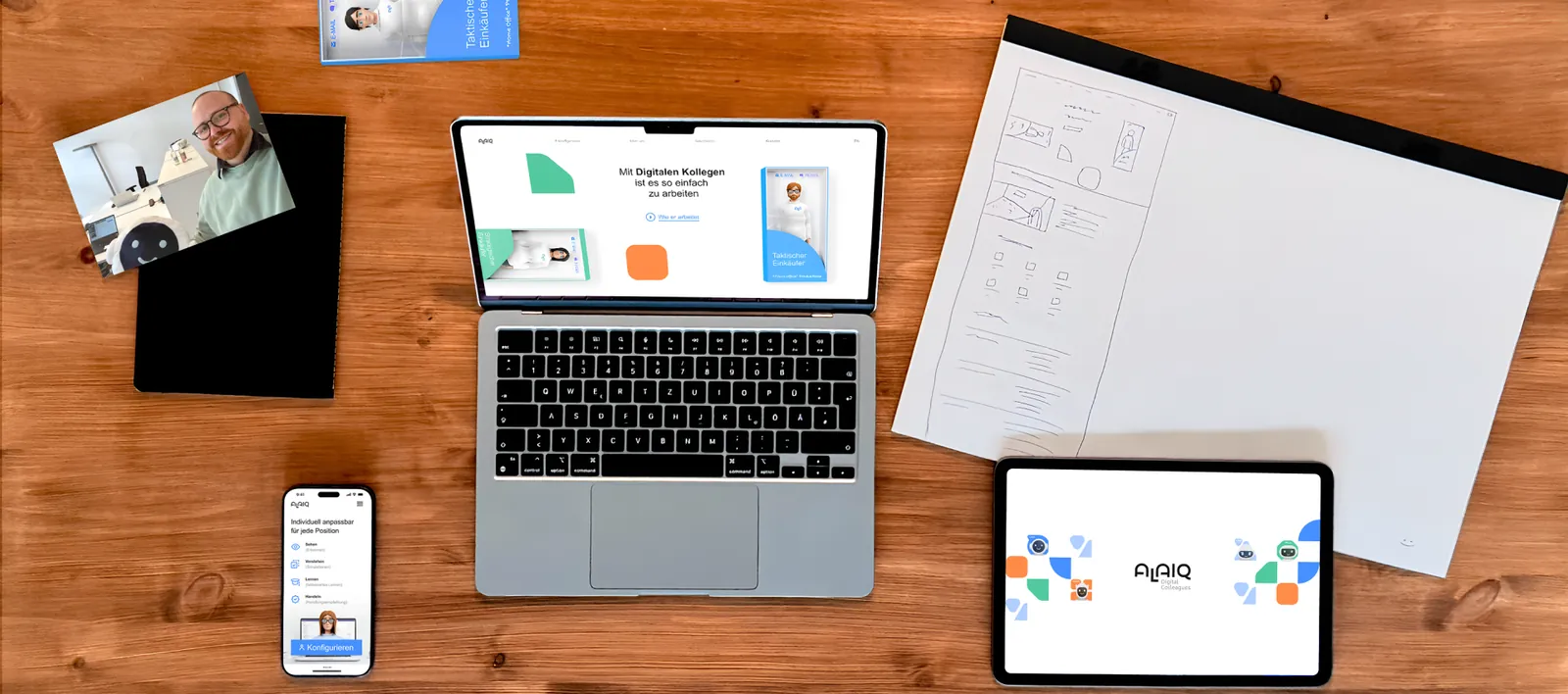
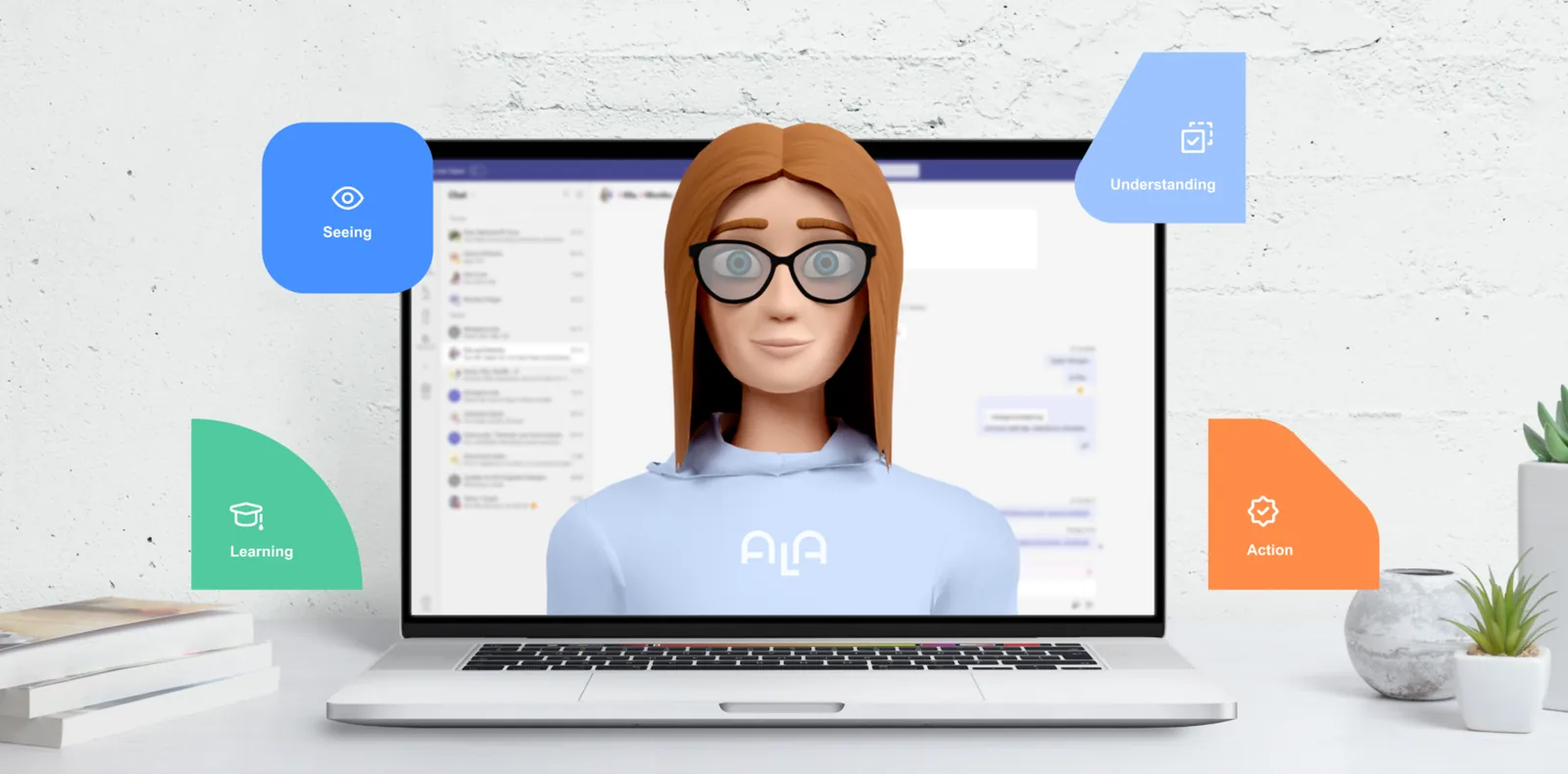
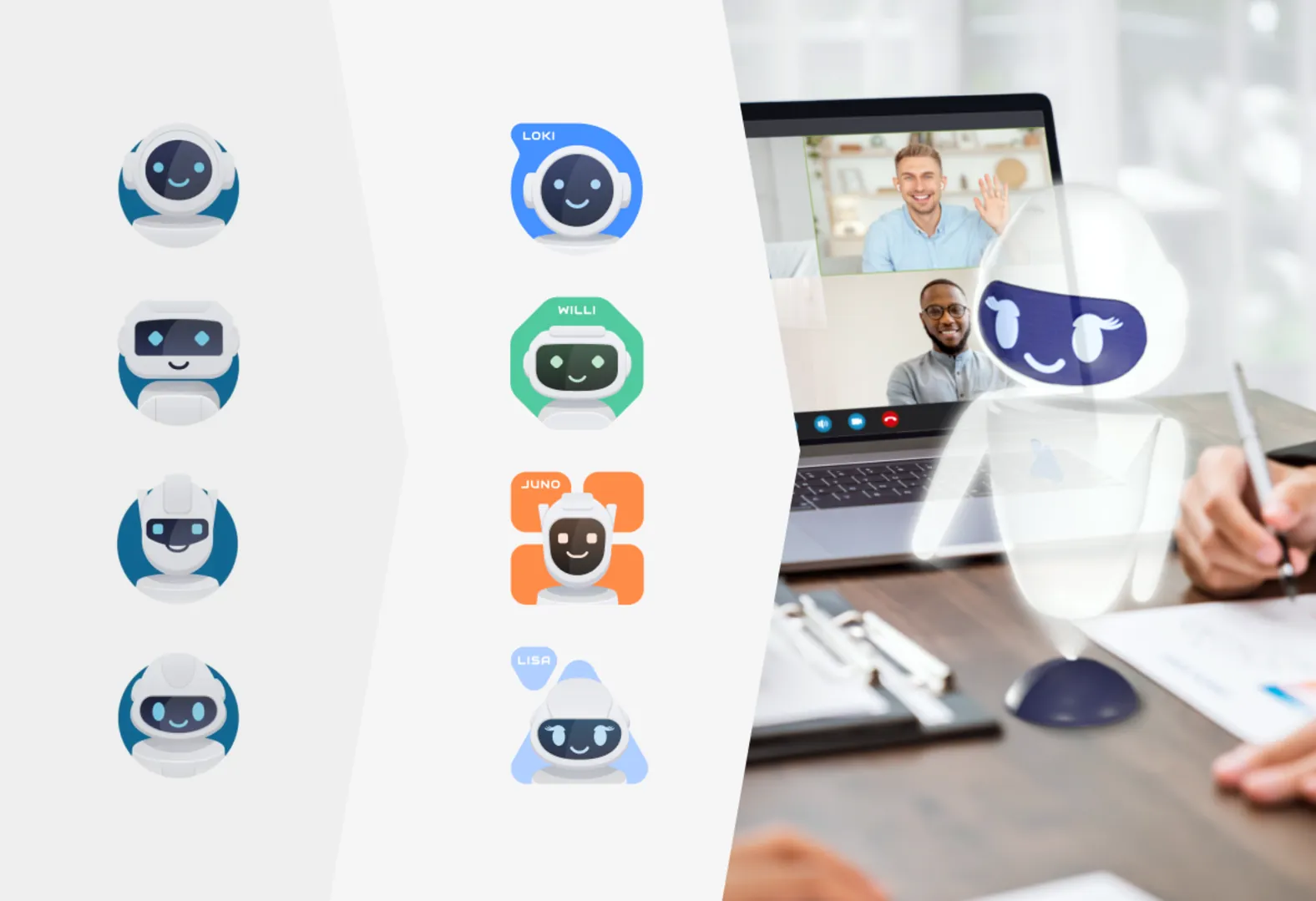
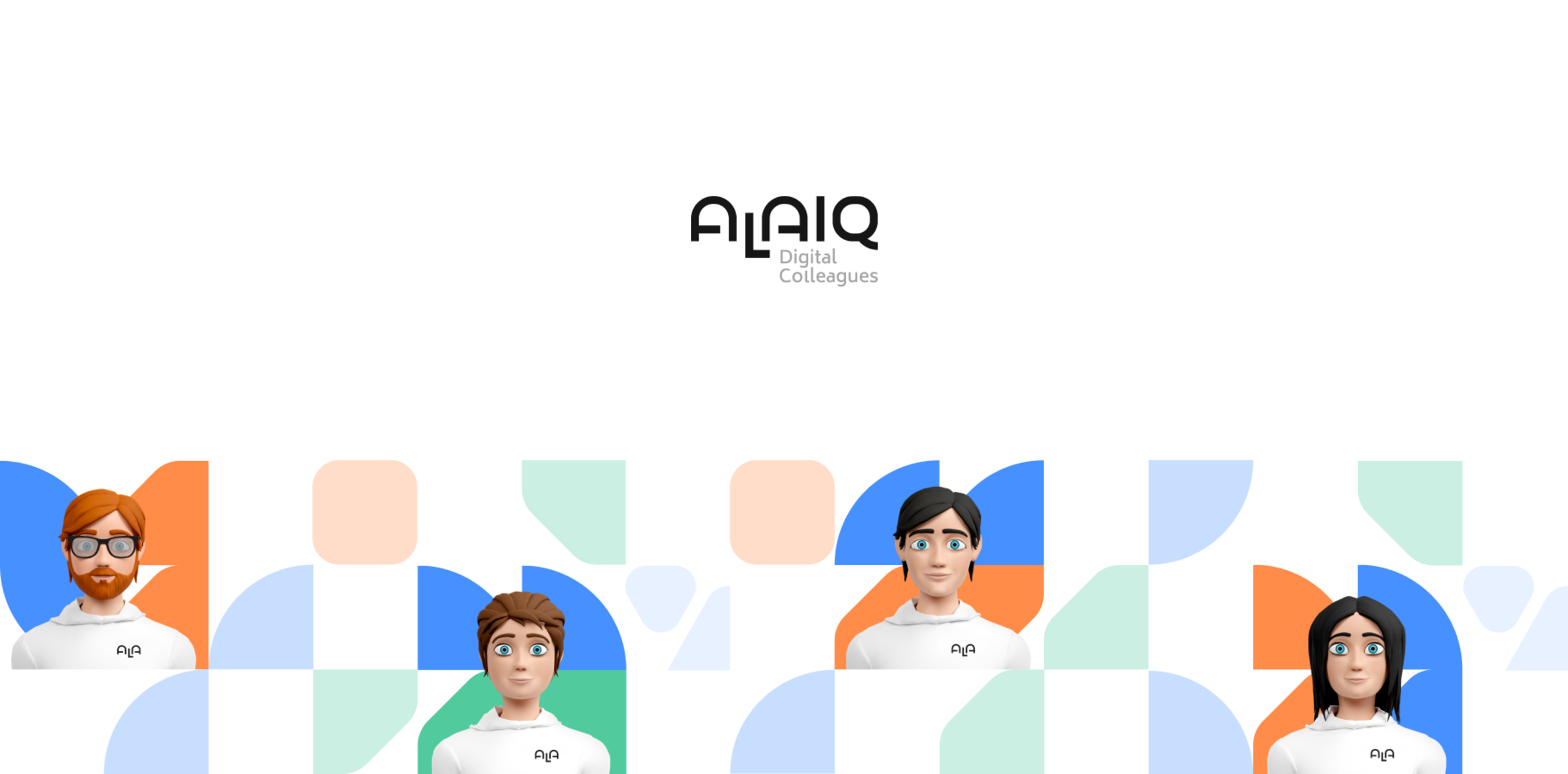
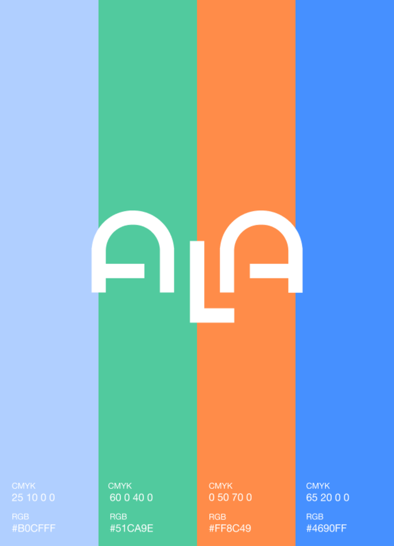
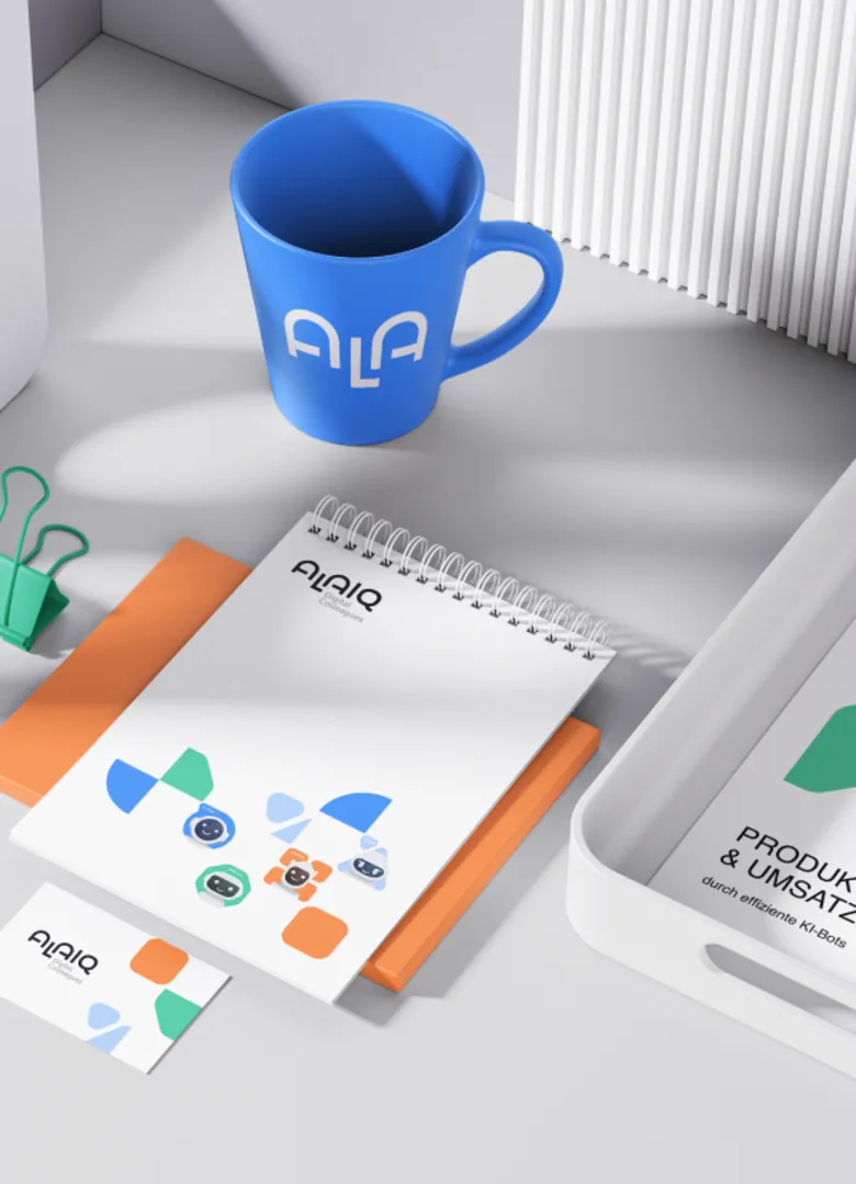
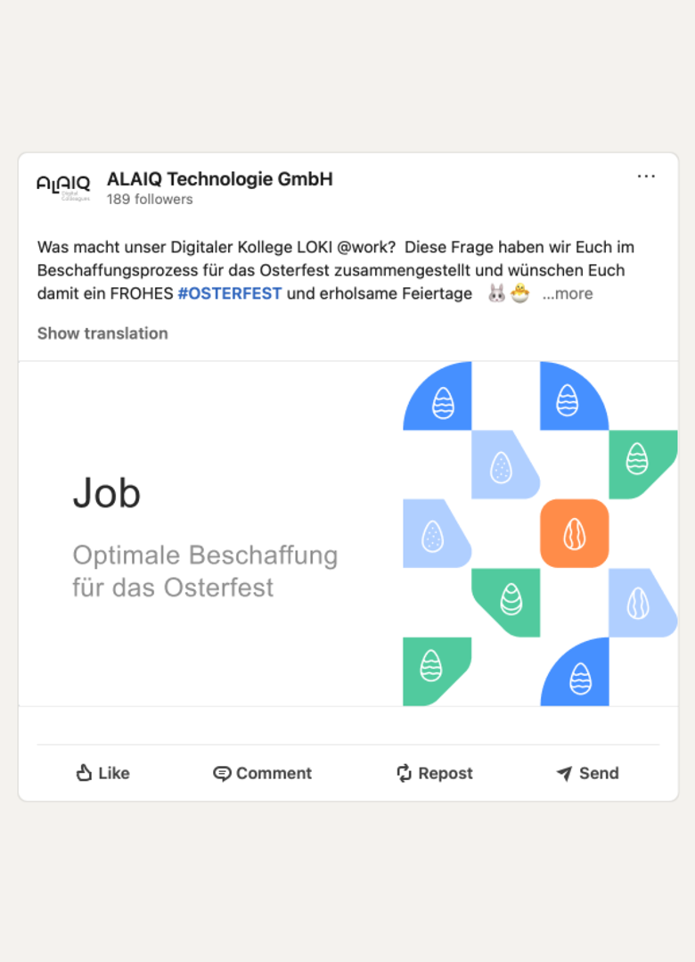
I created a warm, friendly brand ecosystem for ALAIQ and “Digitale Kollegen” using soft geometric shapes, humanized vector assets, and a crisp, accessible color palette of blues, greens, and oranges, rolled out across over 100 digital, video, and print assets.
Why This Way
By leaning into approachability rather than cold tech, the system reframed automated AI agents as supportive “colleagues,” lowering adoption anxiety and building immediate trust with non-technical B2B buyers.

Journey Mapping, Personas & Problem Framing
What I Built
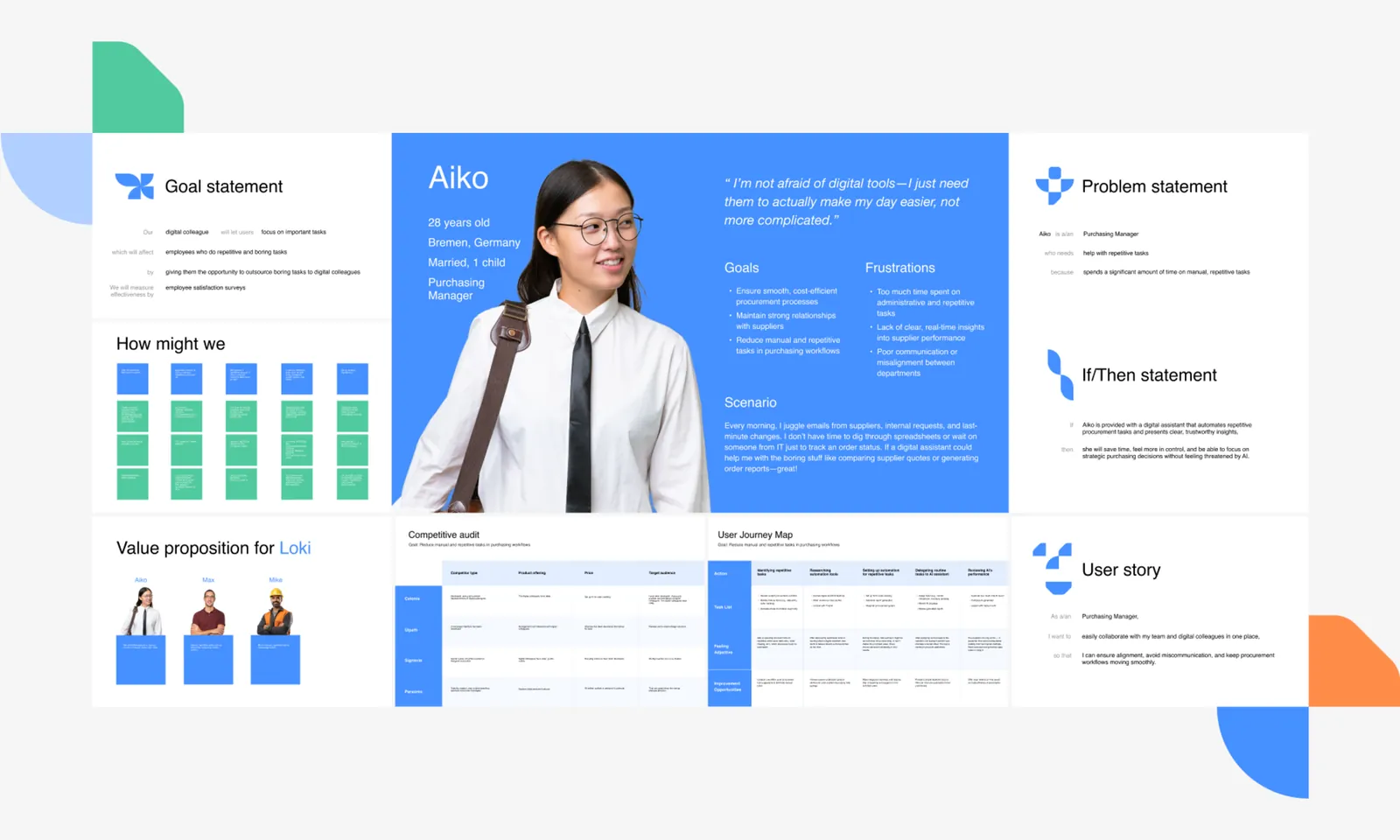
I built core research artifacts including user personas (like Aiko, the Purchasing Manager), user journey maps, and “How Might We” matrixes, then framed the product experience around user control and a clear, logical if/then structure before any visual design began.
Why This Way
Designing the onboarding around targeted user goal statements ensures the platform solves real day-to-day frustrations — like tracking order statuses — proving the tool makes work easier, not more complicated.
Adaptive Website Framework & Integrated Marketing Campaign
What I Built
Faced with frequent shifts in startup direction, I redesigned the web portal from scratch three separate times, favoring intentionally simplified interfaces over prolonged design phases, and built a creative concept around “digital colleagues in a box” that capitalized on the viral Barbie movie trend.
Why This Way
Streamlining the UI architecture let engineering ship major strategic updates rapidly without bottlenecks, while leveraging a massive pop-culture trend maximized engagement and brought approachable visibility to a complex B2B product.

Conversational Architecture & Usability Testing
What I Built
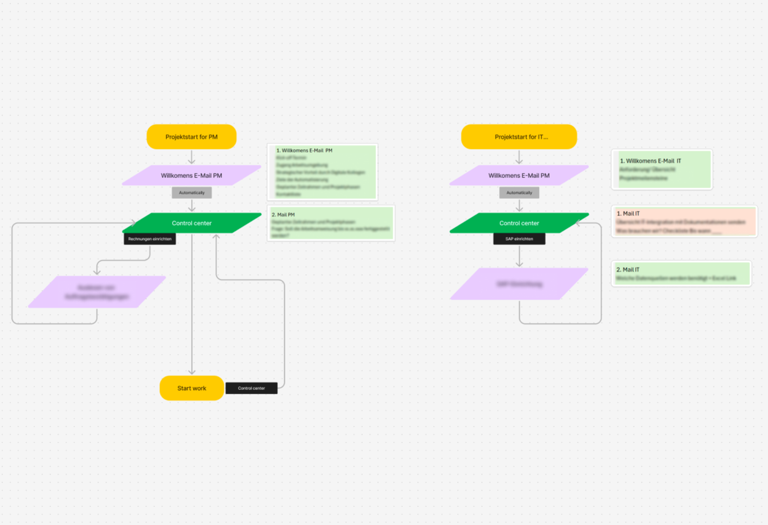
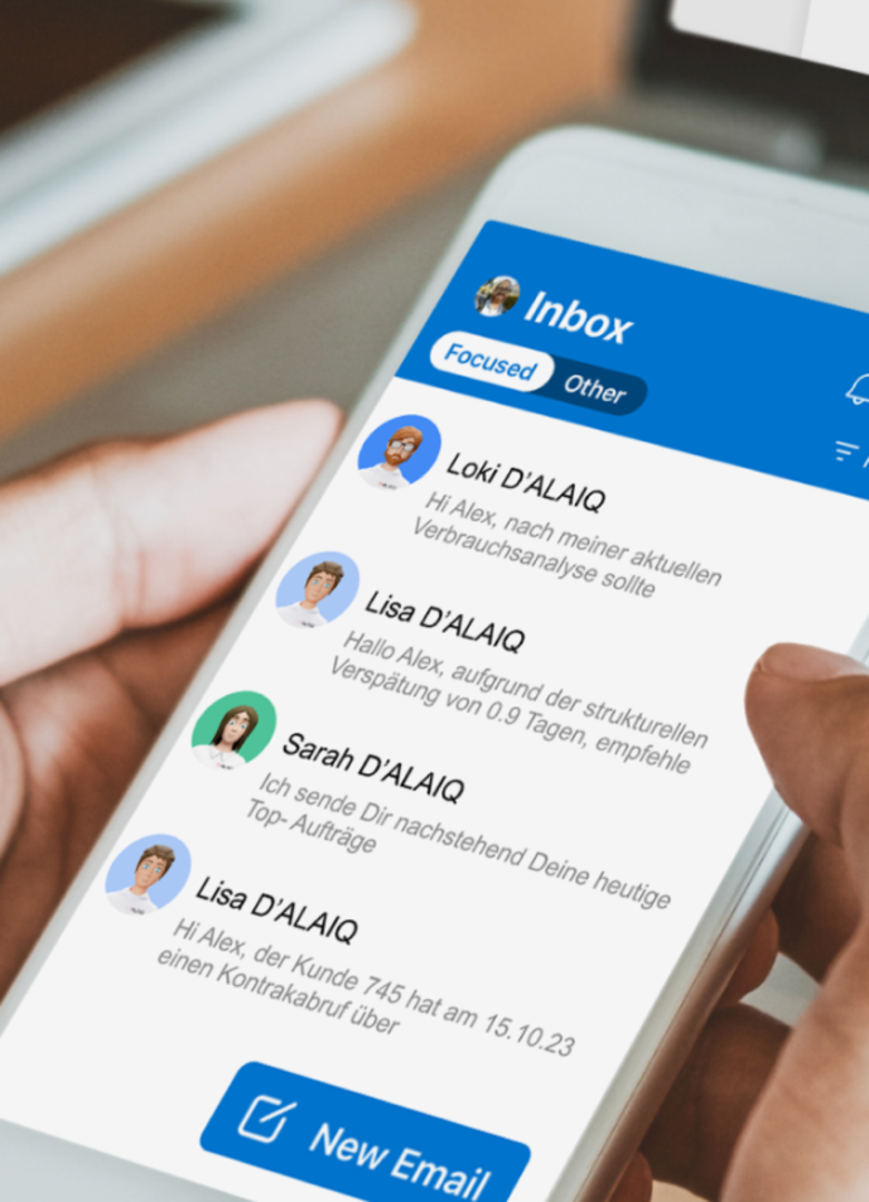
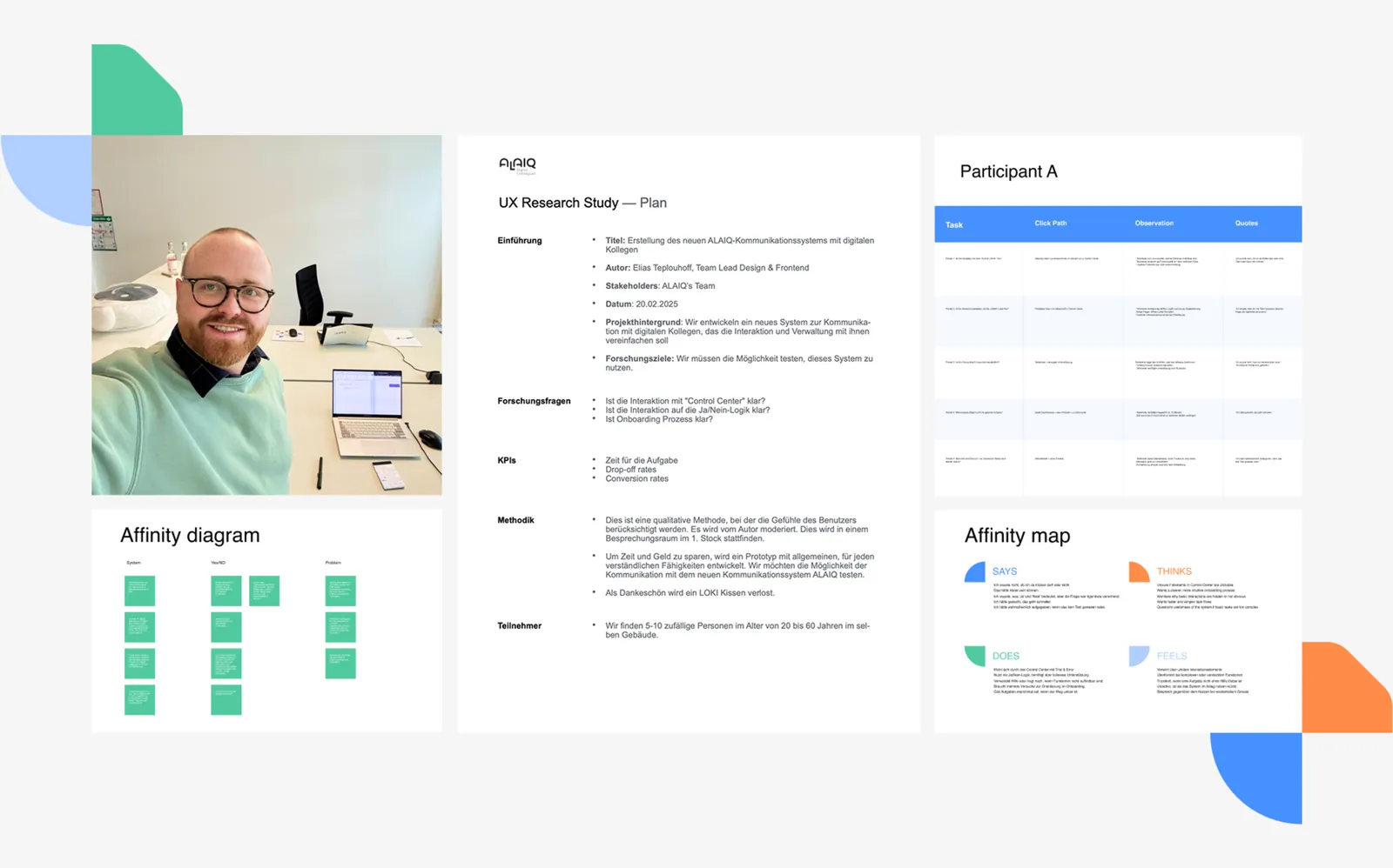
I mapped conversational email workflows and ran rapid usability testing loops, deliberately rejecting a proprietary standalone app or nested Slack integrations in favor of meeting non-technical employees where they already worked — in their inbox.
Why This Way
Utilizing everyday email threads eliminated the learning curve for the end user, letting non-technical employees delegate tasks and receive updates from their digital colleague using communication habits they already had.
By humanizing complex AI mechanics and prioritizing hyper-adaptable, frictionless interfaces, the new ecosystem bridged the trust gap and drove measurable commercial and operational success.
Accelerated B2B Lead Conversion
The trend-aligned web framework and intuitive onboarding concept demystified the product for non-technical buyers, driving a 30% increase in customer flow straight from the website.
Frictionless Human-AI Adoption
Usability testing proved that leveraging existing email habits drastically reduced user friction, increasing customer satisfaction and long-term willingness to adopt the product.
Scalable Design System & Agility
Training internal teams on the unified, warm geometric design system increased team efficiency by 30%, and let the design system scale seamlessly across three major strategic pivots.
Creative Campaign & Market Visibility
Syncing the core web interface with the viral “digital colleagues in a box” campaign captured rapid B2B market attention for a complex backend technology.
Next case study

